The Story Behind My Name
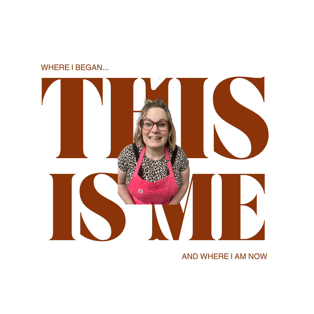
Where I Started
I quit my job to pursue my passion for calligraphy, and honestly, I had a very different idea of what that would look like.
At the beginning, I thought I was going to build a business teaching creative classes. Coming from a marketing background, I knew one thing for sure. I needed a brand people would remember. Something recognisable, something with personality. The name came from this idea that I would spend my days creating work that made people feel warm and cosy inside. Soft, comforting, wholesome vibes. That’s how Toasty Type was born.
Turns out I am a bit too sarcastic for all that fluffy stuff, so while the meaning behind the name did not exactly stick, the brand certainly did.
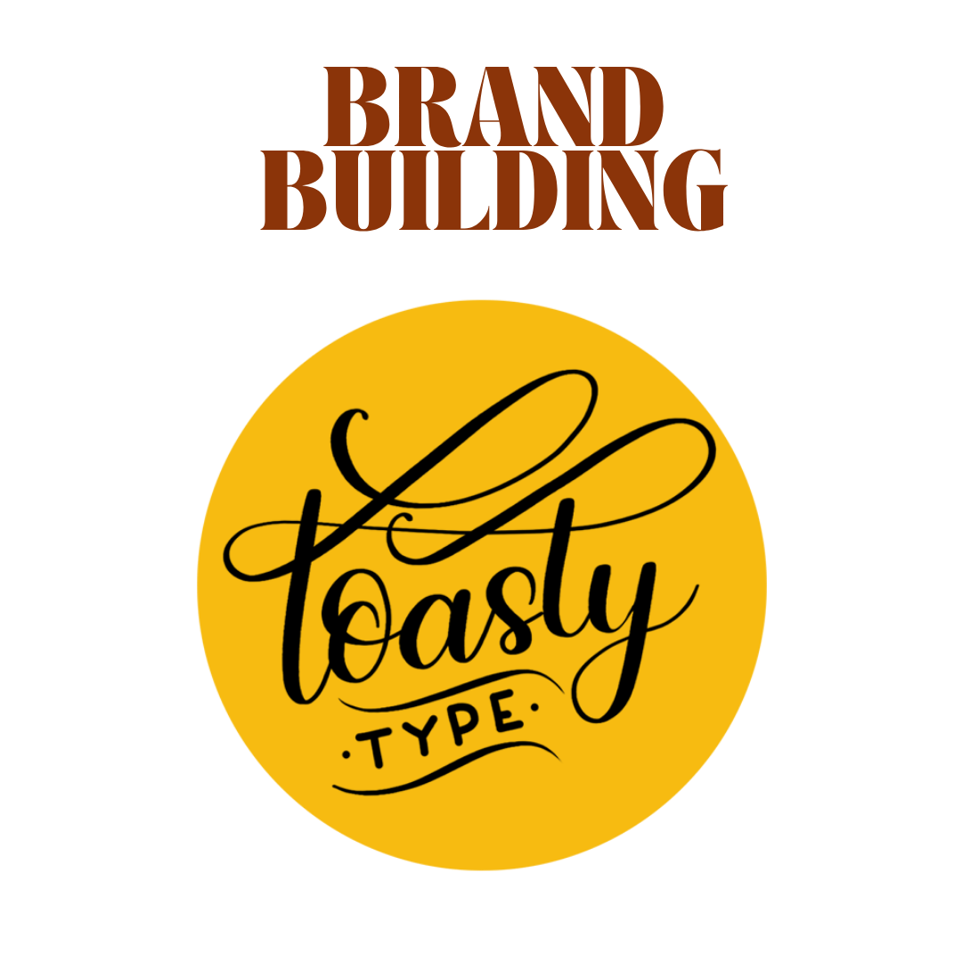
THE OG LOGO
I spent hours obsessing over my logo. Tweaking, changing, overthinking every tiny detail. I fell in love with mustard yellow, ( I still am) and eventually landed on a brand that felt like me…at the time. Looking back, I was clearly in my flourishing era.
Fast forward eight years and Toasty Type has grown into something I am incredibly proud of. It has become recognisable, it has evolved, and it has taken me places I never expected. But the truth is, the person behind the brand has changed, a lot!
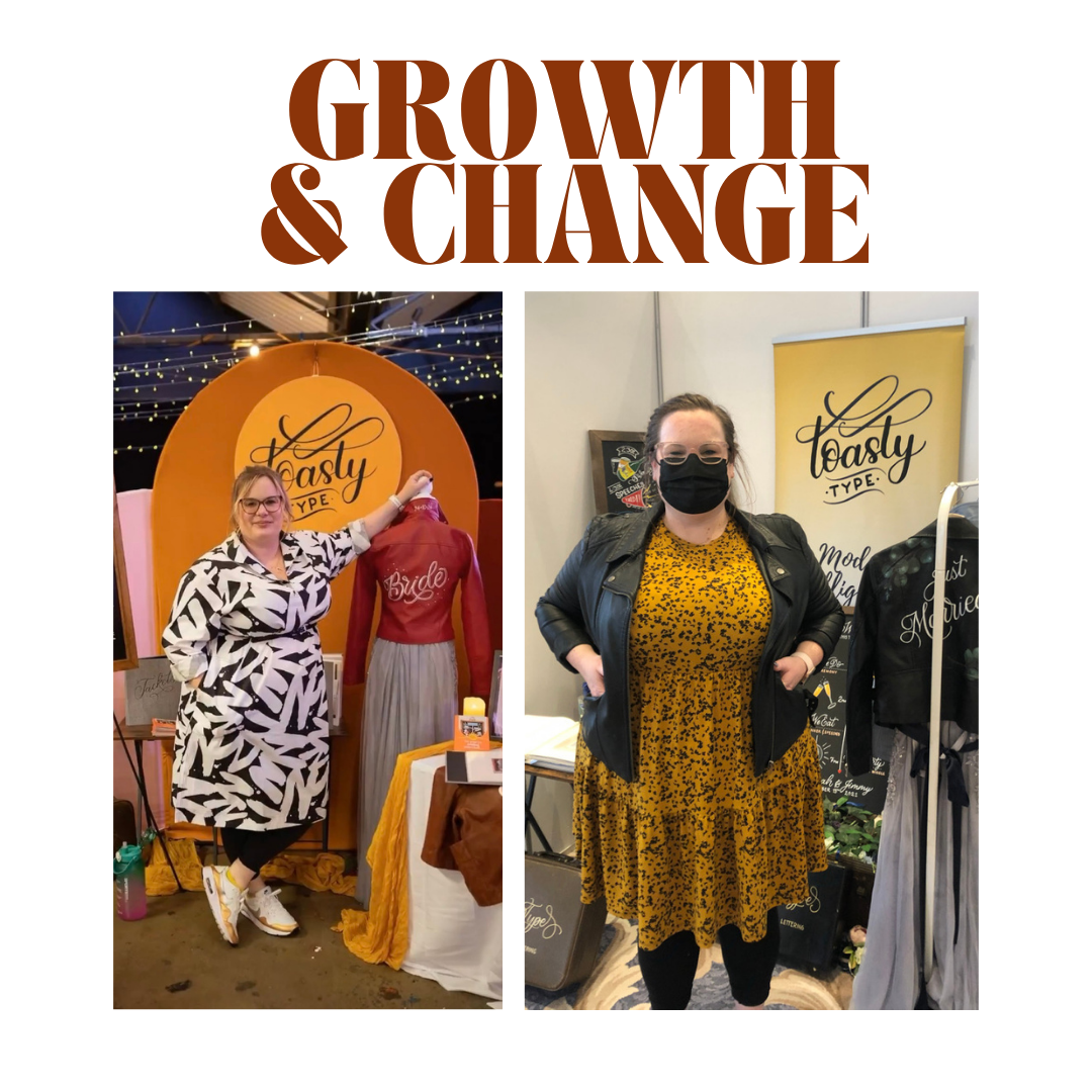
Going Pear Shaped
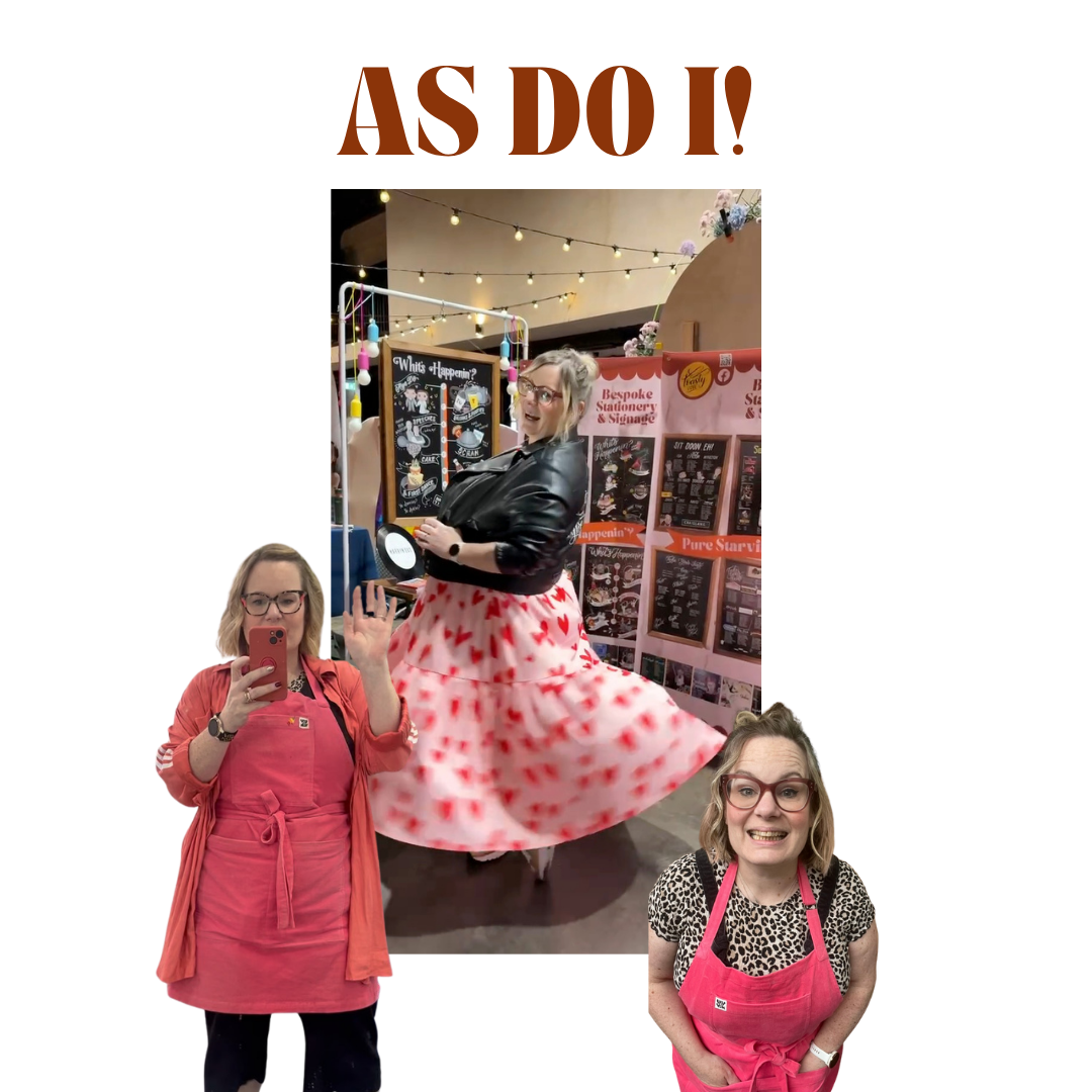
Covid lockdowns shifted everything, my new and growing business stalled. Events and weddings were cancelled and so, like many others, I pivoted as best I could. At the same time my brother was diagnosed with bowel cancer and my life became a flurry of chemo appointments, care and worry - all while trying to keep Toasty Type alive. Losing my brother to cancer later that year changed me in ways I could never have planned or prepared for. It reshaped how I see the world, my work, and myself.
And while those experiences were incredibly hard, they have slowly brought me to a place where I feel more grounded. More sure of who I am and what I want my business to be, which is why I knew it was time for a glow up. If I’m honest, my old logo was a bit like a ninja. You had to guess what I did, and that is not ideal when you are running a business. I wanted something clearer. Bolder. Something that actually reflects who I am now and what Toasty Type has become.
New and Improved
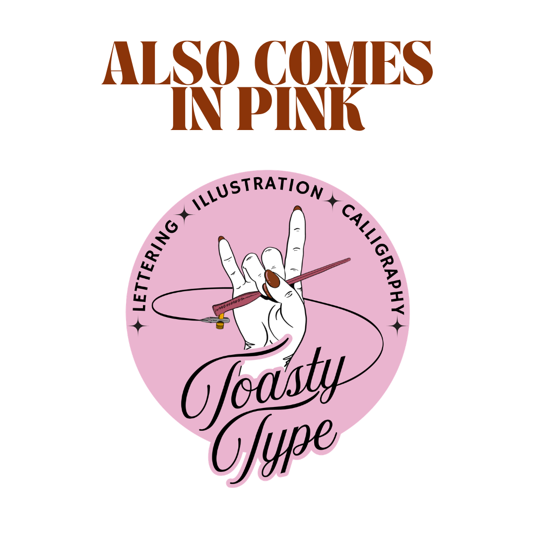
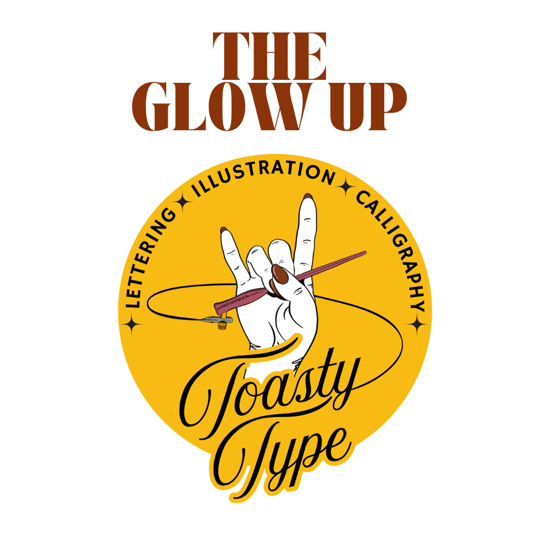
So here we are, meet Toasty Type 2.0.
A new look, a new era. I might be in my pink phase right now, but the mustard yellow is not going anywhere. Some things are just too good to let go of.
This feels like a new chapter. One that is more aligned, more intentional, and a lot more me- and I am so happy to share it with you